Design Thoughts

The Italy of the Italians Part 1

Italian culture is arguably the single most important contributor to western civilization. Whether in the arts, sciences, commerce, or even governance (current intrigues, of course, excluded) both the legacies of individual such as Michelangelo, Galileo, Lorenzo De Medici, and Justinian, or the collective influences of the Renaissance and Roman Empire of which they were are part, the Italians' contribution to our way of life is immeasurable and profound. A living testament to this legacy is found in the many fine cites throughout Italy, a few of which form the basis of this series of posts. [caption id="" align="alignnone" width="300"]

Mantua Skyline[/caption]

Having seen many the cities one typically thinks of when thinking of Italy, my recently completed trip focused on what one may call second (and third) tier cites, in this case mostly in Emilia Romagna. I use the term second and third tier advisedly, for the cities visited are amongst the finest urban environments anywhere, and their lesser notoriety in not a slight to their beauty or charm, merely the lack of recognition of their qualities amongst non-Italophiles.

Visiting Mantua, Ferarra, and Bologna (along with brief stopovers in Modena, Parma, Turin, and Varese) was an opportunity to see a side of Italy unavailable to those whose focus is only on the country's most popular destinations. Unavailable, because those cities are filled not only by their residents, but also throngs of visitors, whose impact on the cityscape is significant. Without the crowds and tour buses, one can arrive at a better sense of how these spaces function on a day-to-day basis -- to see how they function as working cities – and not merely places of leisure. The public spaces visited were filled with the population of the city served, allowing a more tangible measure of their utility and their successes.

[caption id="attachment_1606" align="alignnone" width="300"] Ferrara Streetscape[/caption]
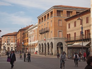
Italy, of course, was not a nation until 1861, so I use the term Italians not to describe a nation in the contemporary sense, but really the group of people who shared a common language and a common history. Unlike say France, Great Britain, or Spain, there was no country of Italy ruled by a powerful gentry (much of Italy was in fact ruled by foreign powers). What it lacked in national unity it made up for in strong regional identity forged by leading cities, with each being the head of government, commerce, and culture for the region. Each primary city was therefore, a distillation of all of the qualities we identify with modern nation states. We too have cities such as these today: London, Tokyo, Paris, and so on, each the cultural, financial, and governing capital of their nation. What is remarkable about the Italian cities described here, is they achieved comparable levels of greatness in their own time, with populations of maybe 30 to 60 thousands and not millions. This compact size relative to greatness allows an intimate relationship to be forged,, even during a brief sojourn.

[caption id="attachment_1597" align="alignnone" width="700"] Bologna the City of Colonnades[/caption]

Mantua, Ferarra, and Bologna’s origins can be traced back prior to the Roman Empire, though they did not flourish until the late Middle Ages or the Renaissance. In addition to this shared imperial heritage they rose to prominence while ruled by a leading family, whose power came from commerce, banking, or land holding. They were also the seats of bishops. Perhaps it was the concentration of governance (both secular and ecclesiastical) and commerce, and its resulting artistic patronage, which fostered these city-states to greatness. A physical manifestation is to be found within the constructs of the city itself. And even though some grounding in history would help one arrive at a conclusion with greater haste, the observant traveler is bound to come to similar conclusions. The palazzo and duomo fronting the piazza (the traditional market place) is an urban typology typical to almost all cities visited; or, in other-words, both the secular and sectarian seats of power defining the place of public assembly and commerce. Always in the center of the historic city, and always easy to identify by the splendor, size, and regalia of their construction, this logical assembly of edifices imparts to one a knowledge of arrival and of place. With the exception of the duomo, the uses of the buildings may have evolved to our present day, but their function has remained the same: clearly designating a hierarchy of relationships and methods of interaction among the citizenry of the city. And though predictable, there is certainly an abundance of variation within the typology to lend interest to each town visited.

When Cars Were Smaller, But Garages Bigger

I have yet to write about single family homes, for they are not a focus of our practice and typically are not as urban as are apartments and mixed used buildings. Nor have I written of garages or ever thought I would (except in disparaging ways), especially ones that so unabashedly front a street and dominate a building's facade.  But here I go. And to be farther off message, the garages in this post are for really large homes, on really large lots, about as far removed from dense, affordable, and urban (three values we hold) as one could imagine. [caption id="attachment_1468" align="alignnone" width="360" caption="Harvard Belmont Landmark District"][/caption]

Yet despite all of these ideological hurdles, I find the below ensemble (that is primarily in the Harvard-Belmont Historic District) quite urban, and full of useful lessons. So bear with me, and let's have some naughty fun and indulge ourselves in things we know we know we really shouldn't, but can't help not to, and take a stroll through a fancy section of Northwest Capitol Hill and admire some cool mixed function garages.

[caption id="attachment_1453" align="alignnone" width="700" caption="Example 1, West Elevation"][/caption]

The building pictured above is a combination dwelling, garage, and retaining wall, and other functions characteristic of most of the buildings pictured below. I presume it is the sole remains of a larger, no longer extant estate of the same Tudor style. The current home adjacent to this building (and I believe that of its current owners) is of a distinctly post-modern flavor, and was built in 1987, whereas the garage was built at least 70 or 80 years ago. Fronting the property line this edifice lends this single-family residential street a robust, urban character. And though the facade is dominated by garage doors (something I never thought I would even remotely praise), they are well cared for and of a very high quality (carriage doors, I believe they are called), and do nothing to diminish the building's presentation or neighborliness.

[caption id="attachment_1441" align="alignnone" width="700" caption="Example 1, Southwest View"][/caption]

The photo above provides a better view of the work that this structure performs. Note the stairs in the foreground, as well as the rip-rap wall, both in evidence of the volume of earth contained beyond. The original patrons of this parcel had the means to elevate what is typically banal fare - soil retainage and parking - to the realm of architecture and landscape.

[caption id="attachment_1445" align="alignnone" width="700" caption="Example 2"][/caption]

An equally robust wall is the Tudor's next-door neighbor, yet is of a very different character. The garage functionality remains, but the building-as-retaining wall task is here supplemented by this lovely, planted rip-rap wall. Meticulously cared for plants make this an attractive wall indeed.

[caption id="attachment_1444" align="alignnone" width="700" caption="Example 3 West Elevations"][/caption]

A couple of doors down is a third, yet equally apropos approach. While it is true that one sees the derrieres of the autos sheltered within, the design of this wall-carport combo so well echoes that of the tasty little modernist duplexes above that I could not help but include it, hindquarters notwithstanding.

[caption id="attachment_1443" align="alignnone" width="700" caption="Example 3 Carport Detail"][/caption]

Ah, a cantilever roof, that beloved modernist trope, and here dignifying a carport -- now that is attention to detail! Note how the concrete walls (with gorgeous, board formed textures), decisively cut back as they approach the roof, thus to create the cantilever. The bold horizontal lines echoes those of the pair of duplexes and the warmly stained wood ceiling add a touch of class to this most utilitarian of spaces. This is as well designed a carport as you are likely to see on the Hill, or in Seattle, and a testament that (almost) anything can be well designed, regardless of heritage.

[caption id="attachment_1447" align="alignnone" width="700" caption="Example 4 West Elevation"][/caption]

If I were in possession of them, my champagne tastes would be divulged if I were to write that this is my favorite garage of the bunch. Sure, it is the fanciest, but it is also the multitude of functions and happenings that pique my interests. Note the massive wall to the left, and how it translates into the garage structure with its strong buttresses. Again, we have extra fancy carriage doors, and some nice masonry walls. On the right, is an intimate and mysterious entry, leading to a terrace. Beyond is the manor house that lends this building its raison d'être. Again, a very urban solution (albeit ironically) to the automobile storage.

[caption id="attachment_1446" align="alignnone" width="700" caption="Example 4 Entry Gate"][/caption]

My favorite moment of all of these garages is the dark and windy stair that leads to the terrace and (presumed) guest quarters. Entered through an iron gate, what could be more mysterious or provocative?

[caption id="attachment_1452" align="alignnone" width="700" caption="Example 5 West Elevation"][/caption]

Most of us could no more afford these garages than we could the even more opulent homes they serve. Through-block parcels, of at least 10,000 sf, are beyond the reach of most of us. It is nice, though, that we get at least a hint of the dolce vita by passing so closely to these splendid service buildings. The home can be seen to the right (way, way, beyond).

[caption id="attachment_1451" align="alignnone" width="700" caption="Example 5 Stair"][/caption]

The competition to have the most splendid retaining wall/garage/garden/guest house combination must have been keen when these estates were first built, for they are all of the same style. Here, another elegant stair leads up to the garden that the garage helps support.

[caption id="attachment_1450" align="alignnone" width="700" caption="Example 6"][/caption]

Although perhaps absent of some of the refinement of the previous examples this wall/building/garage/guest quarters (anything I missed?) most likely has many more things going on than its relatively demure neighbors. I suspect that tall white walls on either side of the central pavilion define a very French or Italian inspired formal garden. Although not right on the street as the others, the espalier, box hedges, and finely trimmed bit of turf lend the edifice a formality and dignity exhibited in the best urban building.

[caption id="attachment_1442" align="alignnone" width="700" caption="Example 7"][/caption]

More modest in scale, and within the realm of what is achievable by many, this building nicely exhibits the transition from wall, to garage, to simple bungalow. Note how the bungalow is not only cantilevered, but floats above the adjacent wall. Nice!

[caption id="attachment_1448" align="alignnone" width="700" caption="Example 8"][/caption]

A familiar view to most who live on Capitol Hill, this very utilitarian structure may not have the opulence of its neighbors to the west, but its power to shape the landscape is no less. Here, the unadorned concrete (which is the structure - minus brick veneer - of the other examples) performs the same role of vehicle storage and landscape demarcation. To the right, is a finely carved out stair, similar to the others, and leading to the large home which all of this supports.

[caption id="attachment_1449" align="alignnone" width="700" caption="Example 9"][/caption]

There is probably an interesting story behind this final example. Or maybe not. But, just to the right, you can make out part the rather substantial home that I imagine, at one time, was related to the traditional base of this otherwise modernist house. Clearly, the two are not contemporaneous. Was the estate parceled out? I don't know, but I like to think there is a good story here. The garages adaptability and worthy of preservation shows both the utility and propriety of the structure, regardless of  heritage.

Pocket Neighborhoods

[caption id="attachment_1410" align="aligncenter" width="700" caption="Third Street Cottages by Ross Chapin Architects • Developed by The Cottage Company"][/caption] Cohousing, clustered developments, and cottage housing are all examples of Pocket Neighborhoods – a concept that is the subject of Ross Chapin’s newly published book of the same title (Tauntum Press, 2011).

Starting off with a forward by Sarah Susanka (the architect of the Not-so-Big House books), Ross presents the concepts of pocket neighborhoods in 4 parts - historical precedents for pocket neighborhoods, contemporary examples of pocket neighborhoods, cohousing communities, and infill/adaptive developments in existing communities. This is a wonderful resource for learning about community oriented design that focuses on human scaled architecture and a smaller ecological footprint. For those that are concerned about quality (of community, relationships, and lifestyle) over quantity (of materialistic and isolated American pop-culture) Ross’ book is a must-read.

I have known Ross for many years – primarily through our good friend Karen DeLucas, who has worked with Ross for the past eight years. A year ago, I was contacted by Ross Ross while he was doing some research for his book and had the pleasure of sharing with him my knowledge of cohousing. I also shared with him our library of photographs from the 20+ Danish cohousing communities Mike and I visited in 2004 – several of which are featured throughout his book.

Ross Chapin is an architect based in Langley, WA – a quaint town at the north end of Whidbey Island, home to 3rd Street Cottages, his first “pocket neighborhood”.

To learn more about pocket neighborhoods visit the website

To buy Ross’ book, click on here

A Welcoming Patina -- an Opening Salvo to Preserve Our Interior Environment

While much effort in architectural design -- and its evaluation -- revolves around the exterior of buildings, it is the interiors that have the most intimate impact on our lives. This dichotomy is understandable, as the exteriors of buildings, and their surrounding streetscape and landscape are fully within the public gaze. We must not, however, forget the interiors behind the facades, especially those that have the special characteristic of a  'welcoming patina', a quality resulting from age and/or use that make one feel especially comfortable within them. In addition to qualities of age and use, I would add  vernacular design, the resourcefulness of the interior's designer's ability (professional or otherwise) to assemble disparate, often overlooked elements in successful and unique ways. Driven by a lack of resources (and, perhaps with a conscious eye to resisting the corporate, sterile design that pervades our society), these artisans craft a pleasing aesthetic experience from materials that may have otherwise been discarded by others. They resist the impulse to make something 'better' by giving it a fresh coat of paint, a shiny polish, or, by replacing it with something new, and instead revel in incorporating (or letting be) worn paint, mis-matched furnishings, and unfinished walls. Art figures in as well, be it oil on canvas or discarded bottle caps.

On Capitol Hill we are blessed not only with a fine urban (exterior) street-scape, but also with many patinad/vernacular interiors that were not necessarily designed by architects or interior designers, but perhaps by the owners, tenants, artists, and patrons of the space themselves. Interiors by happenstance, as it were.  Thus formed, our shops, restaurants, cafes, and theaters reveal the brush strokes of their many creators, including that most ineffable of characteristics, the patina of time. As Capitol Hill prepares for its next round of development, it is precisely these slightly worn and dusty places that are the types of spaces that we will pine for the most should we lose them, as they are the most difficult to re-create.

Bauhaus Cafe is as fine an example of a welcoming patina and vernacular design as one could find on the Hill. In February 2002, when I was in Seattle for a job interview, Bauhaus cafe was the first Capitol Hill business I entered, and I remember it well. It not only sold me on Seattle, but especially on Capitol Hill, for any neighborhood that could support such a vibrant, gorgeous, interior was certainly where I wanted to live. Three weeks later I left Manhattan for Seattle.

There was obviously design intent and careful consideration in Bauhaus's layout, yet it feels as if it evolved over time, and has a great Northwest vernacular; it is as if it were shaped by the customers and baristas within, with their collective energy somehow contributing to a space that was meant to be.

In addition to its patina and vernacular, Bauhaus Cafe also has a nice variety of spatial types. From the large, main cafe space with its large windows fronting Pine Street, to the more intimate mezzanine and the still more cozy western sliver of a space that looks west, over Melrose Avenue. Finding space where available and making it work, is I suppose another quality of this kind of space. Divorced from planning done by remote corporate headquarters, such spaces adapt to the eddies and flows of their environment, grounding them to their site in a manner impossible to achieve without recognizing the potential in eccentric space.

There is a fine array of materials defining Bauhaus's spaces. The most robust is the wood of the grand bookshelf, which even includes one of those cool rolling ladders. The size of the wall provides an excellent and generous space from which to display the art work that hangs against it. The language of the bookcase nicely morphs into that of the staircase that leads to the mezzanine, which has a classic, load bearing masonry wall on its southern end, and a guard rail/wall affording one a prospect from which to look out over the main cafe space. And though there is an amazing amount of variety within a relatively compact space, the tones and materials blend together in a way so as not complete with each other or for attention. The dark floors, walls, and furniture, emphasize their contrast with the large bright windows. Glare, usually a nuisance and detractor from a space, here heightens one's awareness of the textures and spatial variety.  So complete is the Bauhaus experience, that even it fading exterior sign and crooked storefront proudly proclaim its patina to all who pass.

Although relatively new in its present location, Bimbo's Cantina has many of the above said qualities, yet in a more festive, polychromatic display. Here the interior is an apt reflection of Bimbo's eclectic and tasty offerings. No muted browns and blacks, as at Bauhaus, but vibrant and bright colors reflecting both the food and patrons (who are always a fixture around its welcoming bar). Empty fruit cases, dime-store piñatas, and (every color of the rainbow) sombreros adorn the interior, with an understanding of execution and display of creativity that no suburban, theme-restaurant could ever hope to achieve. And perhaps that is because at Bimbo's, it is not a theme at all, but an exuberant expression of those who created it -- an earnest expression of the people who both own it and work it  -- no a foreign expression of one who does not live the themes display.

Of particular fancy are the bottle-caps, re-purposed in as many ways as there are colors of the caps themselves. I will need to take note over my upcoming visits if these are a dynamic work whose breadth expands with each emptying cerveza. It is more than the objects themselves that are interesting, in fact one could argue that taken singly, they have no real interest in all and would actually be akin to the aforementioned suburban thematic restaurant. What differentiates Bimbo's and other like establishments on the Hill in their use of objet trouvé is in their compositional arrangement, where either through their repetition or assemblage (into forms far divorced from their original), they take on a new and visually pleasing appearance. Such insight into the latent potential of fruit cases is certainly beyond the grasp of an Applebees or Chili's.

By no means are the two above examples even close to representing the depth of Capitol Hill's patinad interiors, they just happen to be the two I visited one Saturday in March. So readers, please offer me your favorite places, with an eye toward continuing this call to action, a call to conserve the best Capitol Hill has to offer.