Design Thoughts

Queen Anne Residence Remodel/Addition

“Places are spaces that you can remember, that you can care about and make a part of your life. Much of what is built now is too tepid to be remembered.”

Chambers for a Memory Palace, by Donlyn Lyndon and Charles W. Moore

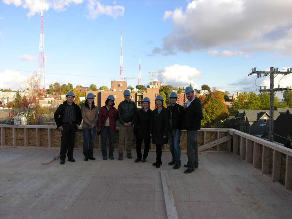
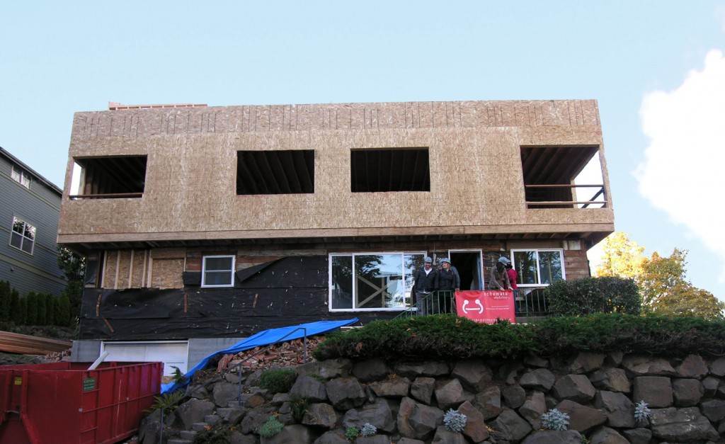
‘Tepid’ may be the word to describe this home before the renovation and addition but ‘memorable’ is now the word that takes its place. Although still in construction, it is beginning to take shape and its pronounced form is highly visible. No longer is it simply a modest home overshadowed by the tall adjacent homes but it is confidently perched on a hill to capture beautiful views of Seattle. The procession through the home is one that continues to entice, the main level has modestly high ceilings, keeping the ceiling height of the original home, while the second level increases the ceiling height by nearly a foot. When you finally reach the third story, the cabana level, the height is unrestricted on the large roof deck overlooking Seattle. This creates a pivotal destination point for the procession through the home.  All these moments have resulted in a truly memorable place that the residents are anxious to make a part of their life.

For more information and to see the rendering and sketches go to our website here


The Function of Ornament

Building at its most fundamental level is about providing shelter from the elements, and to that end is traditionally a reflection of the environmental forces that shaped it as well as the materials and technological savvy available to accomplish the task. Like many places, the Pacific Northwest has its own building traditions reflecting both its environment and resources. On a domestic scale, the craftsman bungalow, perhaps the most recognizable vernacular, possesses large overhangs, lapped siding, and skillfully executed wood trim -- all elements reflecting our region’s wet winter months and abundance of trees. With the expansion of national and international awareness, as well as industrialization, the ties of building to place are increasingly tenuous. Exotic examples from distant locations become more prevalent as designers search outside local precedent to things more tantalizing and evocative.

The Lacrosse Apartments, on the corner of East Thomas Street and Malden Avenue East, is a successful grafting of a typically Pacific Northwest single family residential architectural vocabulary. In this case the craftsmen style is applied onto a larger apartment building designed in a vernacular that is more likely to be seen in the warmer and sunnier climates to our south, in California or even Mexico. This pairing of rather distant vernaculars may at first strike one as odd, but upon further consideration the regional modification to a stucco building makes sense. Generous roof overhangs and projecting window trim, as well as a subtly projecting cornice between the first and second floors, are among those elements on the Lacrosse easily associated with bungalows, while broad expanses of stucco (including Spanish Rococo inspired parapets) reveal some of the Lacrosse’s southern heritage.  Given that stucco needs greater rain protection than the typical brick or lap-siding-clad Capitol Hill apartment, the above mentioned craftsmen elements make a good deal of sense.

Seen from the intersection of Malden Avenue East and East Thomas Street, one of the first architectural features to catch the eye is generous roof overhang, which add a distinctive horizontal emphasis to the elevations. The projecting roofs are larger than one would typically encounter on a bungalow, as they are here appropriately scaled to a three-story building, where the overhang provides greater weather protection to the taller building. Visually, the larger size of the overhangs combined with their lower height relative to the building corners act as a subtractive counter point in distinction to the taller vertical corners. Where the overhangs are absent, the parapets have a robust cap, whose heft -- while not as effective as the overhangs -- provides some measure of water protection to the top of the wall.

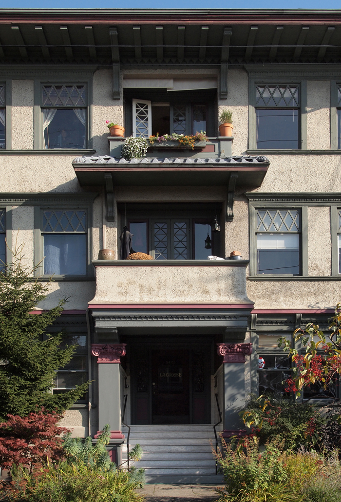
[caption id="attachment_2488" align="alignnone" width="700" caption="The Lacrosse Entry"][/caption]

The Lacrosse’s entry concisely presents many of the building’s noteworthy elements. Columns flanking either side of the stair support a balcony, the base of which is a low cornice demarcating the first from the second floor, while the roof sheltering the balcony provides another hint of the Lacrosse’s dual heritage in the curved ceramic tile shingles commonly seen on mission style buildings. The Terra-cotta pots, although not part of the architecture, are a nice touch. Over-sized support brackets at both the balcony and building roofs lend importance to these portions of the elevation. Also well represented at the entry is the building’s contrasting use of color.

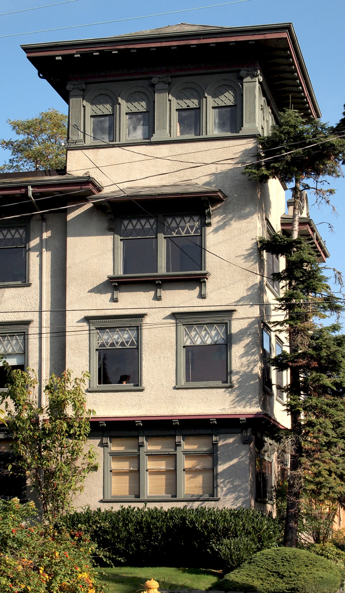
[caption id="attachment_2490" align="alignnone" width="700" caption="Corner Tower at Malden and Thomas"][/caption]

In the above view, the more expressive realization of the cornice first encountered at the entry balcony can be seen demarcating the first and second floors. Above the cornice a slight outward curve directs rainwater away from the first floor, as the roof overhang is too distant to offer much assistance. Above the cornice, the projection of trim over the window’s head deflects water away from the opening, while on the third floor a mini-hip roof protects a pair of windows on the Lacrosse’s main facade. The intersection of Malden Avenue and Thomas Street is marked by a tower which has a post and beam structure, another reference to our region’s timber framing. The transition from the visual mass and solidity of the stucco-clad building base to the lighter and more transparent top floor is one of the best expressive building corners on Capitol Hill and is well integrated with the building's tectonic vocabulary.

[caption id="attachment_2493" align="alignnone" width="700" caption="Cornice at First Floor Window"][/caption]

The attention to detail by the building’s designer is in evidence here, the transition from the cornice, to brackets, to window framing. All elements easily flow from one to another, without a break in rigor. It is as if the second floor gently extended out from the first floor, extruding the brackets in the process. This detail is in contrast to that of the brackets at the entry and the hip roof on the corner, where the desire was to compose those elements as added to the building’s mass, as they are not integral to the window framing and are instead supported by the stucco wall, revealing that every detail has its own specific place within the whole.

Assigning stylistic principles to buildings, while convenient, can gloss over their origins. While craftsman is certainly an easier moniker than, for example, “from-the-damp-northwest-and-made-of-timber”, a knowledge of both the stylistic name and its environmental genesis makes field observations more fulfilling, especially as we gaze upon an assemblage of differing ‘styles’ as well executed as those in the Lacrosse Apartments.


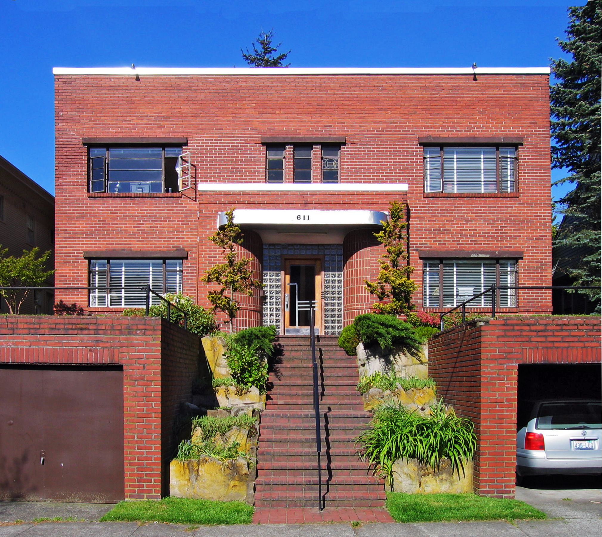
611 Malden Avenue East

Early modernists designers were not gripped by the fear of using brick, as were many later practitioners. With an emphasis on the new, the factory assembled, and the lightweight, early moderns had many reasons to eschew brick: it was traditional, it was heavy (relative to newer materials such as steel and aluminum), and its appearance was fully embraced by society.  Brick was hardly capable of eliciting the wonder and novelty of the new that many of the then avant-garde architects craved. Though I have some sympathies with their reasoning, omitting such a useful material on ideological grounds is not compelling enough to overshadow its many positive attributes, including those of economy, durability, and scale. Looking back far enough, say to the first quarter of the 20thCentury, one finds that brick did make an occasional appearance in modernist design, proving that the goals of cubic mass, simple form, and restraint of ornament were still possible in these brick clad anomalies. These outliers may have come to be because the newer materials architects really wanted to use were not yet readily available nor understood by builders. Mies, the main harbinger of glass and steel, frequently used brick prior to the 1930s, but even such examples are rare (Frank Lloyd Wright is a notable exception). The Lange House, one of Mies’s brick houses, built in 1930. While the brick could have easily been covered in stucco -- making it more abstract and purer of form -- to my eye the brick takes little away from the cubic massing and clean lines. The cleanly detailed brick, along with expansive ribbon windows and an aggressively cantilevered entry canopy leave little room for debate that this is a modernist building. Nevertheless, such well executed buildings did not propagate a confidence that brick was suitable in achieving a modernist aesthetic, its qualities being overlooked in favor of more contemporary and non-traditional materials.

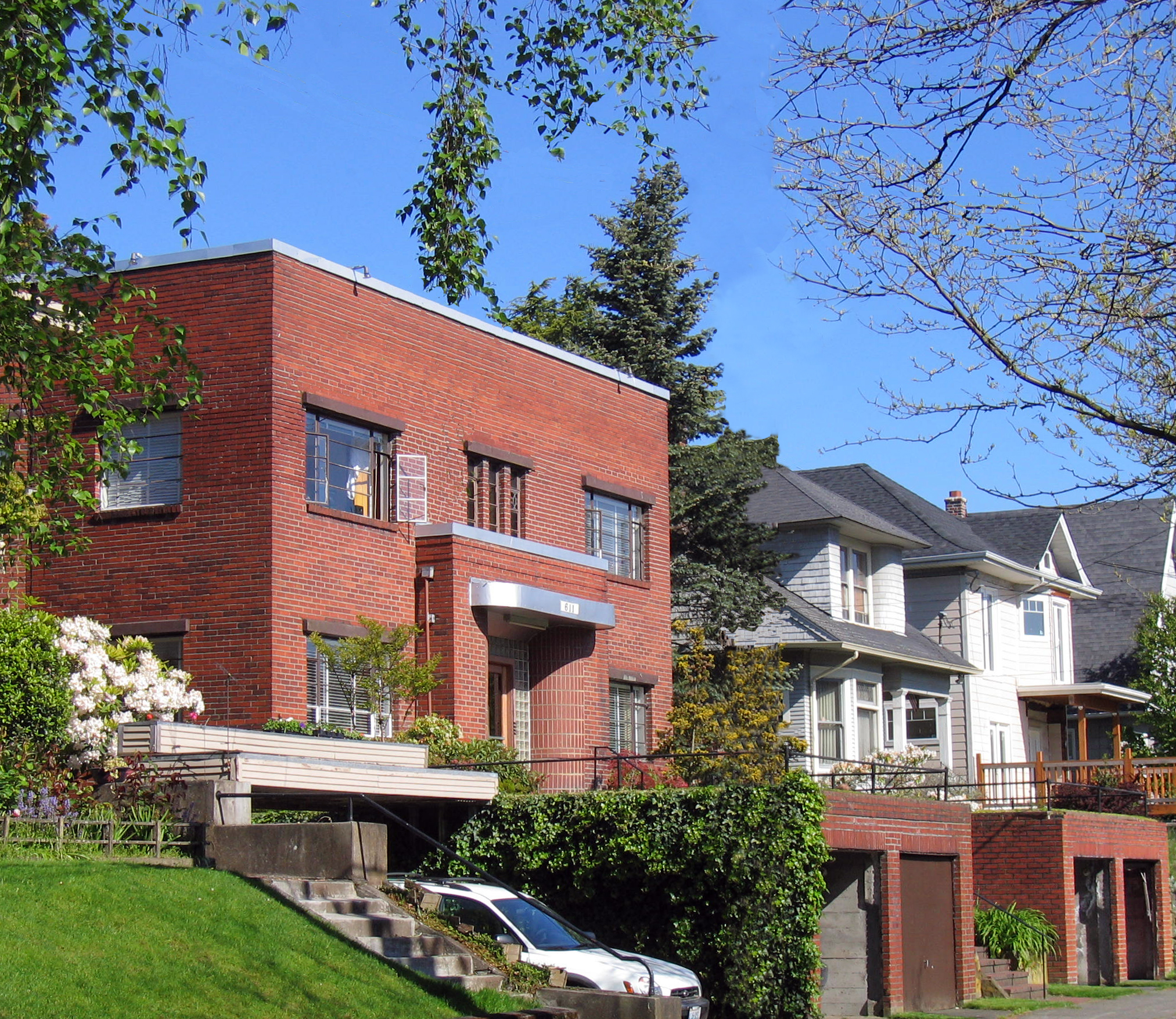
Malden Avenue East -- a favorite Capitol Hill street -- has one of our best early modernist  buildings that not only embraces brick in the tradition of the Lange house, but also shows that its author had no qualms as to its appropriateness in expressing their design intentions. Furthermore, the diminutive number 611 combines the above early 20th Century aesthetic with another equally short-lived, early favorite -- art deco -- an unsung hero of early modern design. Especially exciting about 611 is that (according to King County records), it was built in 1907, making it one of Seattle very early modern buildings, and is step with goings on in other major cities.

While it may be a bit of a push to make much out of cubic massing in such a small building (there is little room to do anything else but), its squareness of presentation nevertheless toes the party line of early modernism, and is punctuated by the squat box that forms the entry vestibule. The building's dual heritage of early modernism and deco is further revealed at the vestibule, where a gently curving, shiny aluminum (or painted to look aluminum) canopy furthers the deco association. Other delightful touches at the vestibule include bricks forming another curve, leading to a deco inspired door surrounded by glass block (one of modernism's most misused materials, but used quite well here). Although lacking the horizontality that the windows that the Lange House displays, those on 611 have a pleasing horizontal proportion to them (kudos to the building's owner for keeping them intact).

Flanking the entry stair are a pair of garages that are as well-integrated into a project as you will see on the Hill, and whose function in the project exceeds the mere utility of parking cars by not only framing the entry steps but also by extending the useful  size of the front lawn. Also done in brick, the garage masses give the small building a greater heft. The pipe rails, lacking the inner rails required by current codes, are a nice foil to the garages' mass, and would do Mies proud. While strong in their attitude to the street, the garages fit in perfectly with the overall  building-landscape approach, stepping down to the sidewalk in a flowing transition of building, turf, garage, and sidewalk.

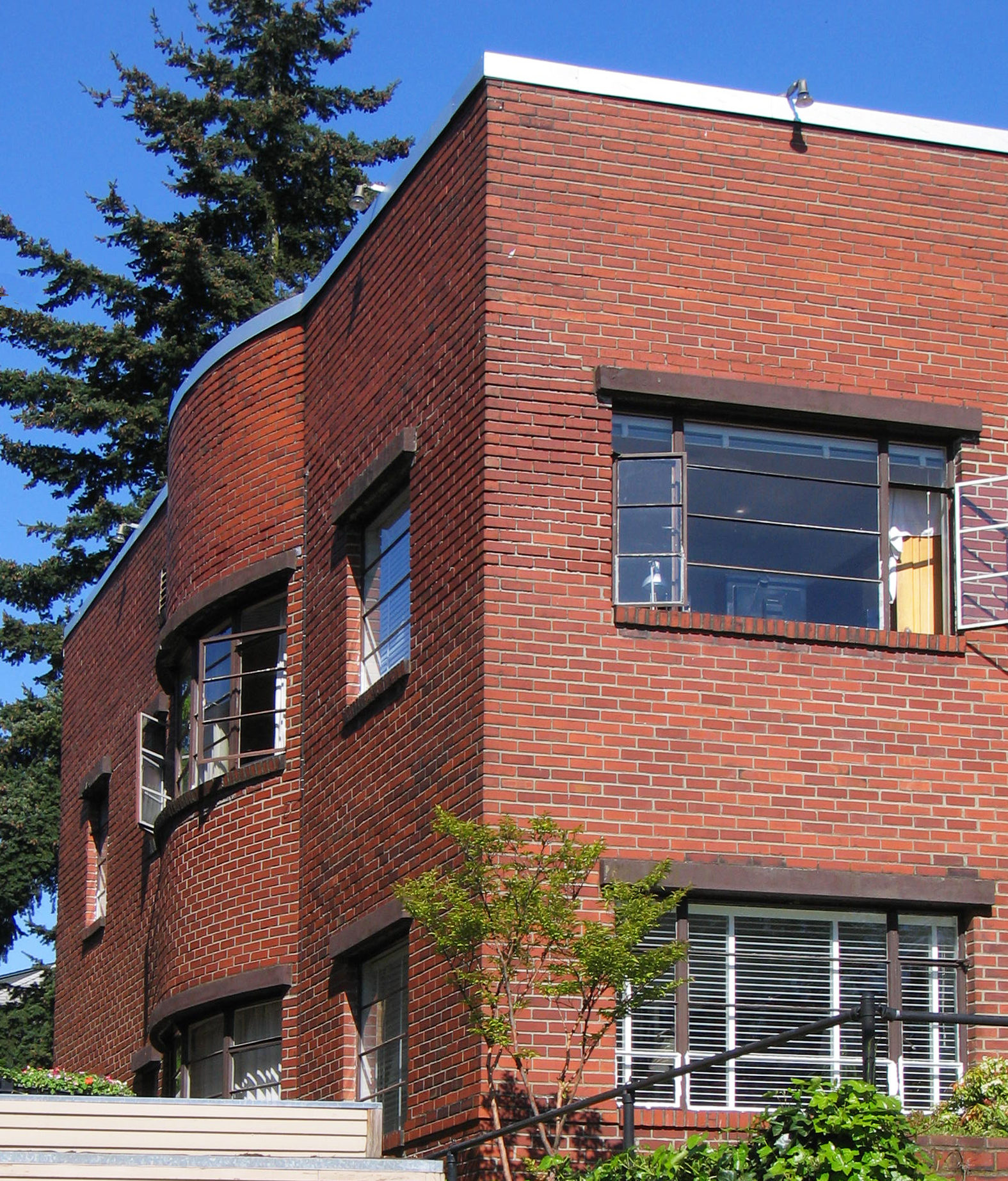
Not all is serious at 611, yet all has its place. The north and south elevations are a bit more relaxed than the rigors of the front, where the mass of brick is pushed out midsection by another gently curving wall, this time on both floors. Not on the front, mind you, where it would be more ‘expressive’, but on the sides, and partially hidden from the street. Perhaps the curved walls ended up on the sides because the interior space dictated their placement, where they may have the greatest benefit to those inside the building; certainly a more important consideration than to those passing by on Malden. Perhaps the architect of this modest yet excellent little building had the confidence and conviction of a seasoned hand, knowing that a little lapse in the rigor of the box -- especially if veiled from one's glance -- would not detract from the nobility of the whole, and felt compelled to be discrete by keeping the curved walls on the side elevations, maintaining the modest street frontage. Perhaps this same perceived modesty kept the architect from making the curved wall out of another material, even another pattern of brick? If my speculations ring true, 611 presents a lesson in modesty from which most of my architect-collegues would benefit.

X Marks the Brace: Resisting Earthquakes on Capitol Hill's Heritage Buildings

11th and Pike Steet

11th and Pike Streets Bracing Diagram

Capitol Hill is in one of the most seismically active (i.e. earthquake prone) areas of the world. While not as prone to the frequencies and durations of seismic events of say Japan, the Pacific Northwest can suffer virtually the same magnitude of earthquake damage. Over the years, as understanding of earthquakes has improved, ways of stemming their destructive impacts has increased. Seismologists and geologists have worked to better identify the location, magnitude, frequency, and duration of seismic events. Architects and engineers have spent decades examining post-earthquake structures, studying what has and has not worked to keep buildings from damage and collapse. In the history of construction, however, such knowledge is relatively recent. Also relatively recent is the use of steel, the primary material used to resist seismic forces. Wood frame construction can be designed to resist earthquakes, but if one is retrofitting older buildings, supplementing the existing structure with steel is usually the most practical and effective way to go.

Many of Capitol Hill's buildings were built prior to the time when seismic bracing was required by code. Such buildings, if they have neither gone under a significant renovation nor a change in use (from, say, an automotive showroom to a restaurant, common here on the Hill), have not been required to incorporate bracing. As seismic bracing is an expensive proposition, building bracing without a mandate is uncommon which is why many of our older buildings simply do without. That being said, the observant Hill resident will notice many older buildings do indeed have bracing, a signifier of a change in a building's original use, its expansion, or significant renovation. While the types of forces to be resisted are the same, the magnitude and resolution varies from building to building. This is largely due to the space available for bracing and the size and configuration of the building, leading to a variety of bracing solutions, many of which are visible on Capitol Hill. As each new earthquake provides a test of the current seismic designs, engineers continually refine their approaches, adding yet another layer of variety and richness to this seemingly utilitarian but lifesaving task.

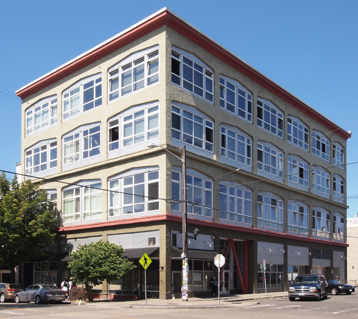
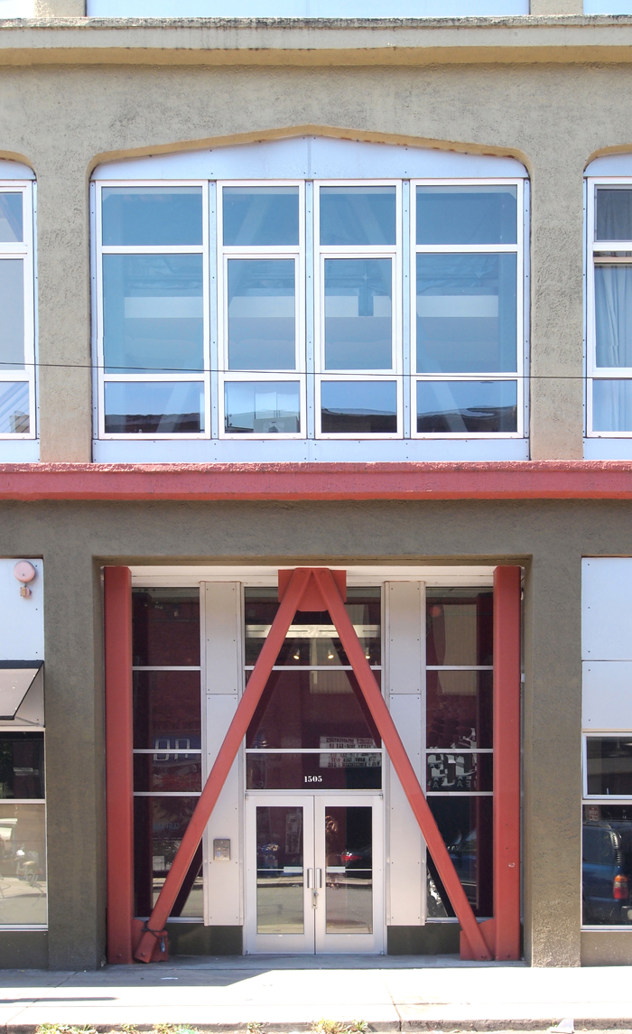
Above is a medium/large heritage building at 11th and Pike Streets. Well cared for -- and recently renovated -- this building's seismic credentials are evident to all who pass through the front door, as they simultaneously pass through a massive, red, chevron brace. And though most robust where the building meets the ground, the brace traces up through at least two floors and two sides. Placing braces along the perimeter of the building is the most efficient deployment; however, circumstance may dictate other locations. In the case of this building, the perimeter walls were available and fit within the over-all renovation concept, so that is where the braces went.

The above diagram parses the visible-from-the-street structural highlights. Typical for this post, the orange represents the seismic bracing, and the blue the gravity structure. To keep things simple, the gravity structure is shown abbreviated (ground floor only) and the seismic indicates only what was visible, although it would be continuous from ground to roof. Eleventh and Pike is a straight forward solution, and very efficient, as it is along the perimeter. Below, one can imagine the strength imparted by the steel frame as one passes between its large, steel tubes.

[caption id="attachment_2326" align="alignnone" width="269" caption="11th and Pike Street Entry"][/caption]
 

[caption id="attachment_2349" align="alignnone" width="280" caption="11th and Pike Street Entry Diagram"][/caption]
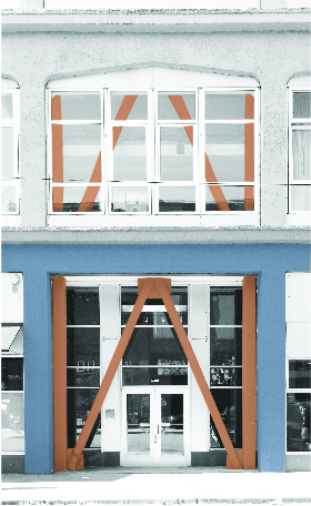
Above is a detailed shot of the chevron brace, but even amongst braced frames there are different structural and architectural solutions available. In the above example, a chevron was chosen as it allows for people to pass under it. Had the brace been an 'X', as seen below, it would not have been possible for people to pass through.

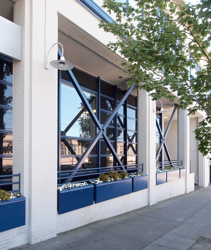
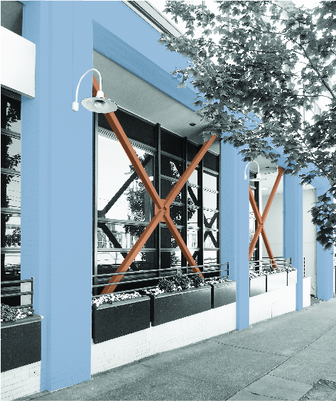
The 'X' braces below are at the East Precinct station, on the Pine Street side. Such braces are preferred to the chevron, as the loads are resolved at the intersecting points of the building's gravity structure. Because they tend to be difficult to pass through, 'X' braces are often not used on retrofits, as they tend to block doors and windows. Where this is not an issue, an 'X' can be the most economical and structurally efficient way to go, and here, the braces are duplicated while the size of individual pieces of steel is reduced and both braces work together to resist seismic loading. Of note, police stations, hospitals, and other essential facilities require a higher level of seismic resistance than commercial buildings.

[caption id="attachment_2327" align="alignnone" width="399" caption="East Precinct 'X' Brace"][/caption]
[caption id="attachment_2333" align="alignnone" width="378" caption="East Precinct 'X' Brace Diagram"][/caption]
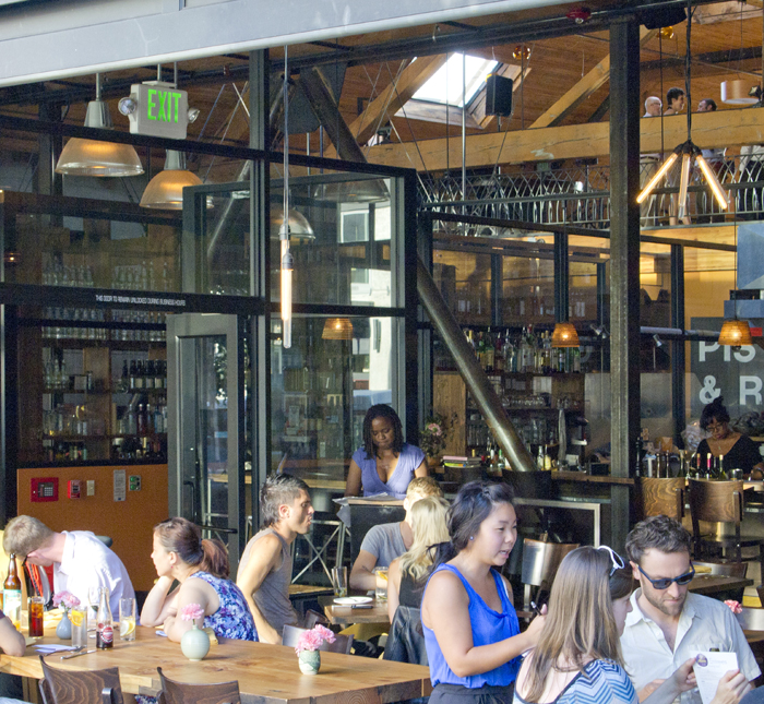
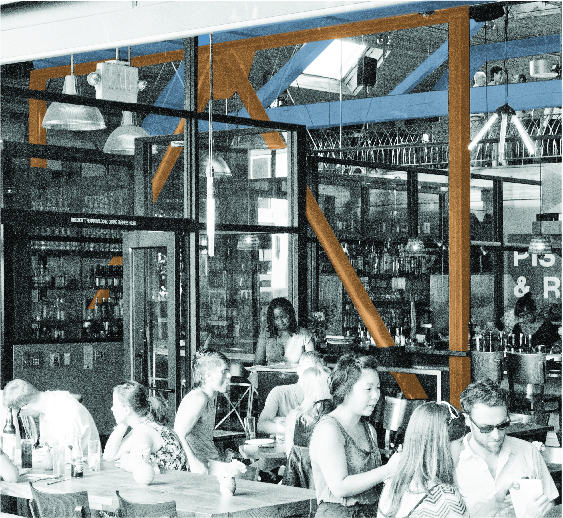
For retail and restaurant tenants, a brace on a building's facade may not be desirable, even if it is the most effective location as its presence could block visual access to window displays. For clients such as these, architects will collaborate with the structural engineer to place the braces within the body of the building, thus maintaining a cleaner and more accessible facade. This interior brace approach can pose some planning obstacles, but also some interesting opportunities to make the new structural elements a feature of the interior, such as in the Piston and Ring Building, on 12th Avenue, and pictured, below. Similar to 11th and Pike, one passes through a chevron brace to gain access, but access is deeper into the building. Here, the designers met the challenge head on, and used the brace to define the building's entry vestibule, as well as provide an organizing element for the bar at Plum. By placing the brace within, I was able to take the photograph from the sidewalk, unobstructed by a brace. The open facade also allows for the much desired connection of diners to the street life passing by. As in the previous diagrams, orange is the seismic brace, and the blue is the gravity structure (roof trusses in this case).

[caption id="attachment_2329" align="alignnone" width="392" caption="The Piston and Ring Building"][/caption]
[caption id="attachment_2328" align="alignnone" width="394" caption="The Piston and Ring Building Diagram"][/caption]
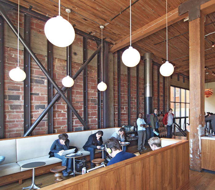
In addition to supporting a building's main structure (the gravity structure), seismic bracing is also used to prevent non-structural elements from collapse during an earthquake.  Many Capitol Hill buildings are built from un-reinforced masonry, or brick that has no steel reinforcing. In some un-reinforced masonry buildings, these walls may not support gravity loads, but are the primary lateral force resisting system of the building. Unfortunately, these walls are not capable of resisting the rapid back-and-forth motions of major earthquakes, and - without steel - a brittle and can collapse. Due to this lack of reinforcing steel, these walls need the same level of attention against seismic events as does the building's gravity structure. While needed, I equate this level of bracing to a labor of love, Why? Because it can be less expensive to demolish and replace such walls, rather than preserve them. But it is a labor of love worthy of support, if a client has the means, as it preserves another layer of authenticity and heritage of buildings in the neighborhood. Below is an image of the Stumptown 12th Avenue coffee house, and the story it tells is of an owner's determination to preserve as much of the original building as possible, almost regardless of effort.  In addition to the orange and blue in the above diagrams, a new color -- yellow -- has been utilized, this time to highlight the reinforcement of the above mentioned masonry in-fill walls. Note the difference in scale and number of the seismic reinforcement brace of the building structure (orange) with its large tube steel members, to that on the smaller but more numerous steel angles supporting the clay tile walls (yellow). Why the effort? I suspect the owner valued the appearance of the historic clay blocks. While still commonly used in Europe, clay blocks are not commonly seen here and their preservation is a wholly appropriate marker for the age of this building. Imagine the effort and expense needed to maintain the wall. Someone really wanted that to stay. And the pattern of the steel channels, marching along in lock-step making sure the blocks don't come crashing down on your noggin, has its own aesthetic appeal.

[caption id="attachment_2330" align="alignnone" width="420" caption="Stumptown at 12th Avenue"][/caption]
 

[caption id="attachment_2331" align="alignnone" width="421" caption="Stumptown at 12th Diagram"][/caption]

The diagram above reveals the complexity that even such a small space can entail. Note the (orange) steel plates on at the intersection of the columns and the beams, top right, that ties the timber beams to the column. The beams on the left of the image (in blue) appear to be supporting the (yellow) angles that brace the clay blocks and tie the roof to the walls. Here, the gravity structure is not only braced, but also braces -- a nice example of the hierarchy of forces being resisted.

Above are but a few of the examples around us of updated structures on Capitol Hill. As our historic buildings are re-purposed and renovated, we will be treated to ever new solutions to keep our heritage buildings standing in our shaky corner of the world.

 

Pike Street's Nicest Storefront

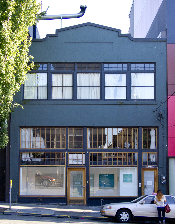
Capitol Hill's Pike-Pine corridor is our neighborhood's greatest urban asset and home to some of our best buildings. Odd Fellow's Hall, Agnes Lofts, and the Elysian Brewing building are just a few of the notables. In addition to these larger buildings, there is (at least) one real gem of a building, but easily missed due to its diminutive size and modest appearance. Don't let its size fool you, for this small edifice possesses a singular quality that makes it a giant amongst its larger peers -- an incredibly handsome and well-preserved wood storefront, remarkable both in its delicacy and in that it unpainted wood-- a bold approach given our 8 - 9 months of rather damp weather (paint is tougher than sealer). Fitting cozily between two recent and boldly modern buildings, 1115 E. Pike does not give an inch to its new block-mates. In fact, the two contemporaries framing it heighten the building’s light touch and historic qualities. Former tenants for the building include the Seattle Academy of Arts and Sciences, who used it as their music and activities building, after which it was the Capitol Hill LGBT center. Originally, it was an automotive parts building. It is owned by Anne Michelson, who built the condominiums next door (to the west) and also owns Crescent Down Works (http://www.crescentdownworks.com/), whose offices are inside, and whose fine down garments are made just around the corner at 1423 10th Avenue.


Unlike today's storefront window systems, which are almost exclusively made of aluminum (and of much greater heft), those on many of our heritage buildings are made from wood -- most likely Douglas Fir -- our region's most popular species for both rough carpentry (structural use) and fine wood working (furniture). And though I cannot be certain this is Doug-Fir, the storefront does combine both of its favored attributes, for here we have mullions (which are structural) as finely crafted as if they were ornamental woodworking (furniture). This level of handcrafted quality was typical before mass-produced steel and then aluminum storefronts came to the forefront.  Not encrusted with decades of paint or the often multitude of replacements parts, the storefront on 1115 is remarkably intact and in stunning shape, radiating a pleasing golden glow.

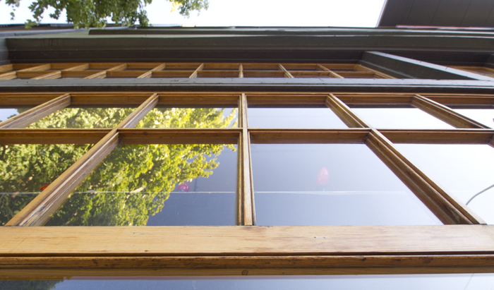
Examining the two photos above, one can see that this storefront was built on-site. Despite the (dare I say) machine-like precision of the smaller mullions, the large wood framing members (in blue) have an irregular pattern, indicative of the different trades involved in the storefront's erection (rough framing verses fine woodworking). The photo above shows how the window maker cheated the left transom mullions to be a bit smaller than those in the field to the right, in order to account for the relative imprecision of the larger structural framing. This does not detract from the facade's overall presentation; however, it may actually enhance it by nicely juxtaposing the precision of the window mullions and their clear finish, with that of the large framing members and their dark, ink-blue paint.

This photo reveals how the window itself is framed.  Even though constructed on a par with fine woodworking techniques, its structural role is an important driver in its final form. The part of the mullions furthest from the face of the pane of the glass is the primary structure; the slimmer profiled piece that is closer to the glass is what is holding the glass in place.  Though separate, each contributes to the overall integrity of the assembly. The differing sizes relay this hierarchical deployment, as well as adding nice shadow lines and detail to the whole. This is ultimately, the way it should be, isn't it? -- Beauty derived from a clear and recognizable hierarchy of parts to the whole, with no artificial ingredients needed. A discerning eye may also notice one real advantage our heritage storefronts have over those of today – no insulating glass! Like countless other, older Hill buildings, the glass in this assemble is ¼” thick single pane glass. Today’s high performance systems are an assemblage of two ¼” panes, separated by ½” of air, all contributing to a much more energy efficient product. Modern energy codes are a good and necessary thing, and well worth the efforts, but the aesthetic results are of secondary concern.