Design Thoughts

The Subversive Origins of the Craftsman Bungalow

Charming, desired by many, and ubiquitous in the Pacific Northwest, the Craftsman bungalow is the quintessential Seattle home typology, yet its origins have a decidedly more contrarian nature than one would think given its pleasant demeanor. Granted, one’s attraction to any given building is typically founded on whether one finds its appearance pleasing, its utility supportive for its prescribed tasks, and it‘s construction and craft sufficiently robust – qualities that the Craftsman succeeds at with verve.  The bungalow is also noteworthy in that it is also one of our regions’ best representations of the ever-present, larger cultural forces shaping our built environment. These forces bear themselves out once one looks beyond the Craftsman’s ‘Northwest regional’ charms and compares it to the buildings it resolutely, if politely, stands in contrast to. As usual, our very own Capitol Hill provides among the best venues in Seattle to ponder the inherent contradictions of charming versus agitating exemplified by this building type.

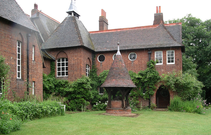
The Red House, London, England (Wikipedia Image)

Tracing it roots to the English Arts and Crafts movement of the 19th century and to such seminal works as the Red House by Morris and Webb (just outside of London), Arts and Crafts design and its progeny in the United States marked a massive shift in design theory that ultimately gave birth to modernism, albeit along a rather circuitous path few would have predicted. The designers of the Red House and other notable British architects of the time chose to reject the prevalent pedagogical reverence for classical antiquity with its emphasis on “universal” tenets of beauty, symmetry, balance, and proportion.  Instead they chose to organize spaces based upon use as well as on local cultural and construction traditions. This focus on the local, instead of the universal, led to buildings that looked less as if their origins were in ancient Greece and Rome, and more as though they were the stuff of local traditions and craft. While such vernacular building has existed for time immemorial, up until the Arts and Crafts movement, it had rarely (if ever) been embraced by either European or the nascent American architectural profession, whose pedagogy was founded upon classical traditions. By embracing the vernacular, many architects took a rather bold leap by acknowledging that non-professional/non-academic precedents actually had valid contributions to make.

The architects of the Arts and Crafts Movement shifted so-called good taste – and the taste of their clientele – towards the design of structures based upon the everyday, the serendipitous, and the utilitarian. To design based upon function was also, ironically, to become an underpinning of modernist design. The irony of the shared heritage is, of course, that modernism eventually fell into the trap of classical architecture – a desire to transcend national or cultural boundaries and create a universal architecture. End results aside, the premises of both the Arts and Crafts were provocative, even if the end results were at odds stylistically.

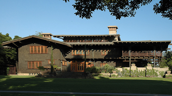
The Gamble House, Pasadena, California (Wikipedia Image)

In the United States, the influence of the Arts and Crafts Movement trended to greater influence the farther one headed west. This makes a great deal of sense, as farther west the ties to European cultural traditions wane, and those of a more uniquely “American “ form take prominence. It’s a combination of geography over time. There is perhaps no better expression of the Arts and Crafts in the West than in the hyper-craftsman, American masterpiece by Greene and Greene -- the Gamble House, in Pasadena, California. Built in 1908-09 and a National Historic Landmark, the Gamble House exhibits many of the key features of the craftsman bungalow, the West Coast version of Arts and Crafts buildings., the In designing a home that emphasized the fine hand carpentry of Japanese ornamentation and building forms rather than the work of the mason, the Greene brothers created one of the truly great American buildings of the 20th Century.  It was a far cry from East Coast, Euro-centric establishment architecture. This emphasis on a fine carpentry and an exotic (Japanese-influenced) design approach had far reaching effects in the western states, especially in the Pacific Northwest where the traditional use and great availability of softwood lumber made the execution of Gamble House-inspired designs a natural progression of the Art and Crafts approach. Additionally, the long overhangs of the Gamble House proved to be welled suited as a precedent for providing sound weather protection in our soggy, maritime climate.

Private Residence, North Capitol Hill

Private Residence, Volunteer Park

A bit closer to home ,in the environs of Volunteer Park, sits a splendid array of these opposing design ideologies – providing an interesting laboratory of East (Coast) verses West (Coast), as it were. Pictured above, are a pair of photos of classically/traditionally inspired homes. Corinthian columns, dentils, the reddest of brick, all the details abound, but I would argue they are bit out of place in the Pacific Northwest. In Boston, Richmond, or Charleston homes such as this are the norm, and speak to that coast’s cultural heritage and proximate influences. More indicative of our region are the two homes pictured below. The top one is a fairly representative bungalow, and lacks the symmetry, clear massing, and classical details of the two former homes. In their place are rafter tails, large overhangs, and details based in the tradition of carpentry, not masonry. The lower example, while not as strictly “craftsman” as the other and hardly humble, was most certainly designed by an architect and follows the new professional traditions then blazed by the Greenes.

Private Residence, North Capitol Hill

Private Residence, Volunteer Park

The Arts and Crafts tradition influenced more than the Craftsman type. Its progeny includes Tudor-influenced structures such as the Red House, some of which are also be found on Capitol Hill. Those structures, however, are not based upon the local materials and traditions, and for that reason are not grounded in our region as is the beloved craftsman -- as subversive in its disposition as the city that has made it a favorite.

Harrison Modern -- Funky Mid-Century Modern that Speaks to Today

I have been riding my bicycle past the Harrison Modern for almost a decade now, always appreciative of its  design and one that I have been yearning to share for some time. Unfortunately, its predominant exposure faces north, making its photography less than ideal for a majority of the year and thus potentially depriving the building the adoration it so deserves. Imagine my great joy when, a couple of weeks back, I was walking past in the late afternoon -- camera in hand -- with the lighting just perfect for portraying the Harrison's many charms.

Located at the intersection of 12th and Harrison, the Harrison Modern is clearly a building whose designers were firmly rooted in mid-century modernism. Built in 1951 and designed by Victor Martin, the Harrison is not only exemplary of that era, but it also foreshadows current trends in architectural design in its use of layered cubic forms as exemplified by the work of such contemporary Dutch architects as MVRDV in the Edificio Celosía, pictured below. This stacking design approach, though all the rage now, was most certainly pretty avant-garde over 60 years ago, and continues to mark the Harrison unique among Capitol Hill's vintage buildings.

What I am calling a stacked or layered design is one where each floor (or grouped floors) is expressed individually and in a very like manner, without the more traditional base, middle, and top.  In both the Harrison and MVRDV example, this stacking is expressed not only by revealing the floor lines, but also by carving out voids for balconies that emphasize the volume of the floors above or below.  The Harrison's design captures this layered design approach to create cleverly framed outdoor spaces that exhibit the modernist desire forblending  indoor and outdoor space, including a generous upper floor balcony that must provide  a great view of the Puget Sound and Olympic Mountains. On a more intimate scale, the north facing veranda of the Harrison is  crisply framed, forming a powerfully simple, elegant, and dignified facade along Harrison Street.

Along 12th Avenue, the busier of the two streets upon which the Harrison is sited, a more formal facade was in order and is fittingly more massive in temperament. The contrast, and utility between, these three elevations is achieved by the simple rotating of the lower and upper floors to best suite their orientation, an ease of effort to effect that has long captivated me. A powerful difference is accorded between the two floors; on the longer, northern elevation is the lower form which represents the void, and on shorter, eastern elevation, it is the upper form. A lower floor ying to the upper floor yang, as it were.

Contrasting the bold cubic forms above are the cascading stones and plantings that mark the entry ramp into the building. While on one level apparently quite different form the building's aesthetic, this little bit of landscape is actually within the spirit of its mid-century heritage, and provides a finishing touch to one of Capitol Hill's finest small buildings. If I squint a bit, I can imagine the Harrison at home in say, Palm Springs or Malibu, but am quite content knowing it is our neighborhood.

Seattle Asian Art Musuem -- Art Deco Splendor in Volunteer Park (Part 1 of 2)

The Seattle Asian Art Museum (SAAM) in Capitol Hill’s Volunteer Park is a splendid building housing a magnificent collection of ancient and contemporary art. Designed by the Seattle firm Bebb and Gould (designers of many noteworthy structures in Seattle, including many prominent homes on Capitol Hill) and built in 1933, it originally housed the entire collection of the Seattle Art Museum. Set within Volunteer Park, SAAM shares its museum-in-the-park setting with other museums, including the Metropolitan Museum of Art, whose home is in New York City’s Central Park. As private collections predated by centuries those offered for public view, the museum-in-the-park typology finds precedent in that of the manor house in the landscape of either a noble’s estate in Europe or that of the landed elite of the East coast of the United States. Both the museum and the public garden are places of leisure, and their pairing is sensible, for sure, and allows for a full day’s outing both in and out-or-doors. In this tradition, SAAM and Volunteer Park present no less compelling a pairing than their historic or big city predecessors.

Art-deco (approximately the style in which SAAM was designed), to my mind, has always had a somewhat precarious and undervalued place within the history of modernist design. It never garnered the serious attention paid to many other 20th century movements, because it was seen, perhaps, as only a pleasant if not too serious ‘scenic’ detour along the thoroughfare of the more rigorous, international style modernism that eclipsed it. Architects, especially, like to see modernism as the built manifestation of industrialization and of the Enlightenment’s goal of human progress. Modernism’s emphasis on functionality, abstraction, and a machine aesthetic are well known. While modernist, art deco was perhaps too populist an expression of modernism’s machine aesthetic ideology, leading to deco’s being ultimately and sadly dismissed by ‘serious’ practitioners and their academies in favor of more somber fare. Ironically, deco’s embellishment with organic motifs and stylized figures doomed it to a short life even if those embellishments were crafted in the same materials, precision, means of that modernism propounded. Given its rather short life and relatively meager legacy, we are fortunate indeed to have such a building as SAAM, and that it is open to all to relish in.

Among modern materials aluminum figures prominently, including in many art deco designs such as at SAAM.  While not a new material, aluminum’s manufacturing costs had been significantly reduced by the late 19th and early 20th century making it more readily available (until then, it was priced as was silver).  As important to its new, ready availability, was aluminum’s light-weight, corrosion resistance, and excellent casting characteristics -- the perfect combination of qualities for the ornamental metal work sought by art deco architects. Add to that the fact these qualities allowed it to be utilized in its pure and visually uncompromised form (by being either polished or clear anodized – not painted) and you have the almost perfect ‘new’ material for the ‘new’ architecture, with no Seattle example better (art deco or otherwise) than in the spectacular aluminum screens and doors that comprise the entry at SAAM. With its organic motifs, shininess, and casting precision, the entry screen ranks among the best architectural features of any building in our city. And, dare I say, many an architect’s current fetish with screening and de-materializing could learn much from the effectiveness of SAAM’s entry screens in achieving those same qualities, the full effectiveness of which are realized best upon entry into SAAM (so go ahead, go in!).

Upon entering SAAM, one is impressed by a lobby that is of a grandeur befitting not only the institution itself, but also of the powerful design vocabulary offered by art deco. Still in a relatively early stage of modernism, art deco had to resolve many new and modern functional requirements, oftentimes without the off-the-shelf products available to today’s practitioners. Things that are now easily ordered from a vendor’s product line were either unavailable or were sufficiently rare enough that the architect had to design those elements themselves. In the skillful hands of SAAM’s architects, such commonalities as air grills, light fixtures, clocks, or doors became objects d’art in-and-of themselves, and are a testament to a comprehensiveness of design mostly absent from today’s buildings. While it is true that standardization has made such objects much more attainable (and therefore useful), there is something lamentable in this loss of design-in-depth. There is no escaping the observation that despite their adding of flourishes to such functional objects, there is an underlying and guiding reliance on streamlined aesthetic resulting from industrial manufacture – an aesthetic that (is essentially the same and) holds its own against a more ideologically correct modernism.


This being art deco, there is more to see than stylized architectural furnishings in SAAM. Gold foil, polished and richly veined marbles, and of course, curved surfaces abound. Despite this potentially chaotic assemblage of luxurious materials and forms, there is a skill in their assembly at SAAM that creates not only sumptuous spaces, but adds a dignity and refinement befitting of the art contained within -- which is the focus of the next post -- the architecture of the galleries themselves.


Project Profile: MCM Lakehouse

Schemata Workshop recently visited the MCM Lakehouse on Lake Sammamish for a construction tour.  This 1960s vintage home renovation project is nearly complete and the owners will be moving in next month. [caption id="attachment_3502" align="alignnone" width="687" caption="We started the tour at the driveway surrounded by the wooded site."][/caption]


[caption id="attachment_3501" align="alignnone" width="386" caption="From the driveway, the stairs lead to a courtyard surrounded by three glazed walls."][/caption]


[caption id="attachment_3503" align="alignnone" width="386" caption="The first space we entered was the two-story living room. The louvered wall and shoji screens above are original to the house."][/caption]


[caption id="attachment_3504" align="alignnone" width="687" caption="Around the corner from the living room is the kitchen. The steel moment frame provides support for the white quartz eating bar."][/caption]


[caption id="attachment_3505" align="alignnone" width="386" caption="Next, we ascended the original stairway with new treads that match the new second floor hardwood floors. The wood handrail is being replaced and will match the stair treads."][/caption]


[caption id="attachment_3506" align="alignnone" width="386" caption="The second floor bathroom is full of natural light. The red light fixtures are an unexpected color accent."][/caption]


[caption id="attachment_3507" align="alignnone" width="386" caption="The original closet drawers and shelves were able to be reused in the bedroom closets."][/caption]


[caption id="attachment_3508" align="alignnone" width="687" caption="Finally, we met outside near the lake. This vintage house now looks very modern!"][/caption]